


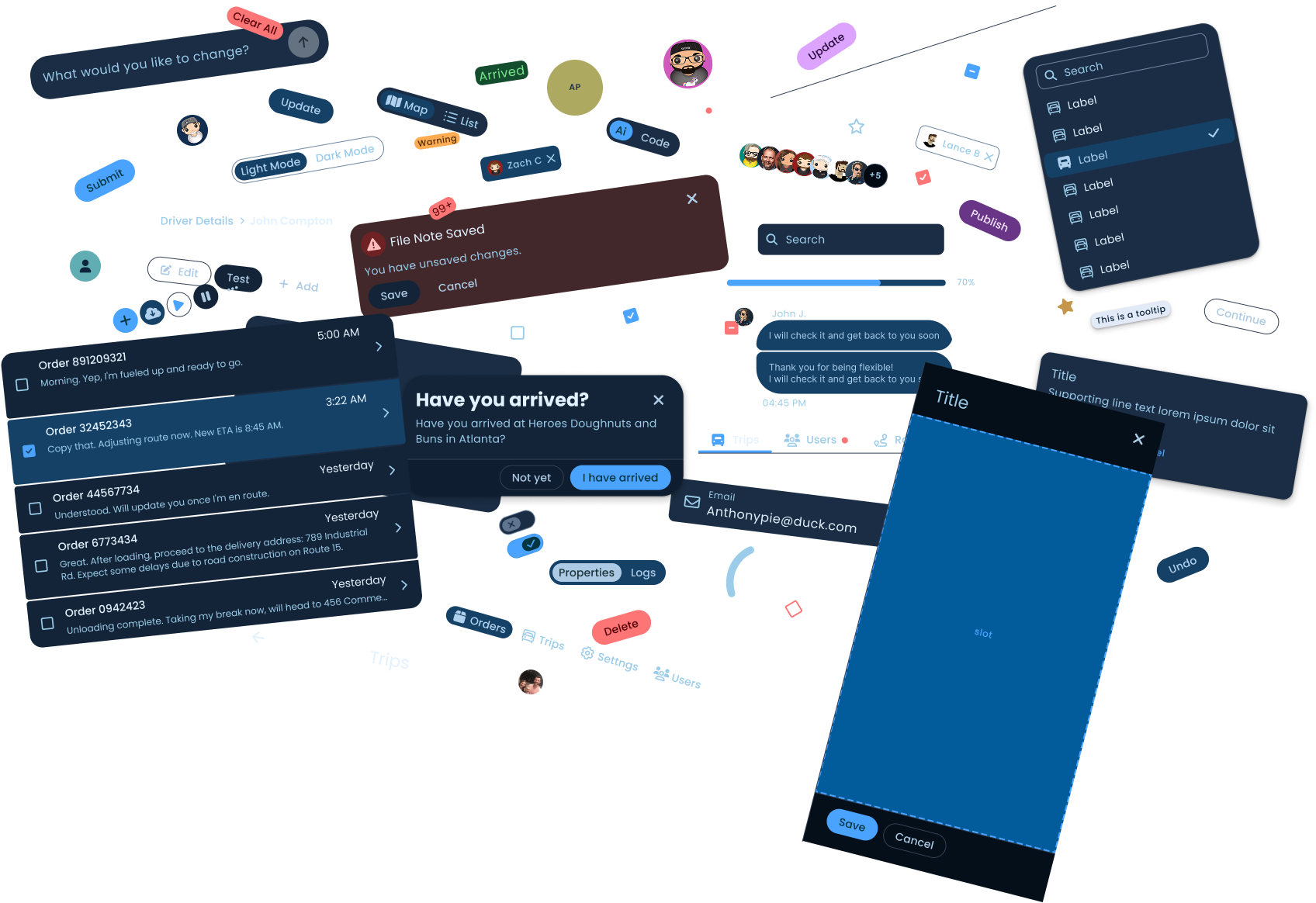
The Tranztec UI Kit is the design system that powers Tranztec's React frontend. Tokens, components, accessibility patterns, documentation, the whole stack. Every React component in the product comes from this kit. When I joined the company, none of this existed. Neither did the concept of it.
I was the only designer at Tranztec. My job covered every product the company shipped, and I didn't have time allocated to build a design system. I built it in the margins, between deliverables, in downtime between projects. About six months of stolen time total, split across two phases.
My role
End-to-end. I designed every component, wrote the dev handoff notes in Figma and Jira, assigned the tickets, and stayed in the loop while engineering built. I worked closely with the dev team throughout — checking what worked for them, adjusting to their feedback, and making sure the kit got used instead of ignored.
There was no design system. No components, no consistent tokens for sizing, color, etc. The previous designer worked in Adobe Illustrator. When designs got made, which wasn't often, they were one-off mockups, no components, no shared styles, no reuse. The dev team mostly built without designs at all.
Phase one was less about replacing things and more about introducing things. I brought in Figma, started building components as I designed new features, and built the kit out organically. Ship a screen, extract the patterns into reusable components, ship the next screen, extract more. Every component was battle-tested before it was in the library.
It also had a cost. After a year of building this way, the kit was working but unwieldy, it wasn't going to play well with future plans for white-labeling and density sizing tokens. On top of that, Figma was eating about 50% of available memory. The kit had outgrown its building framework.
50%
→
8%
Figma memory
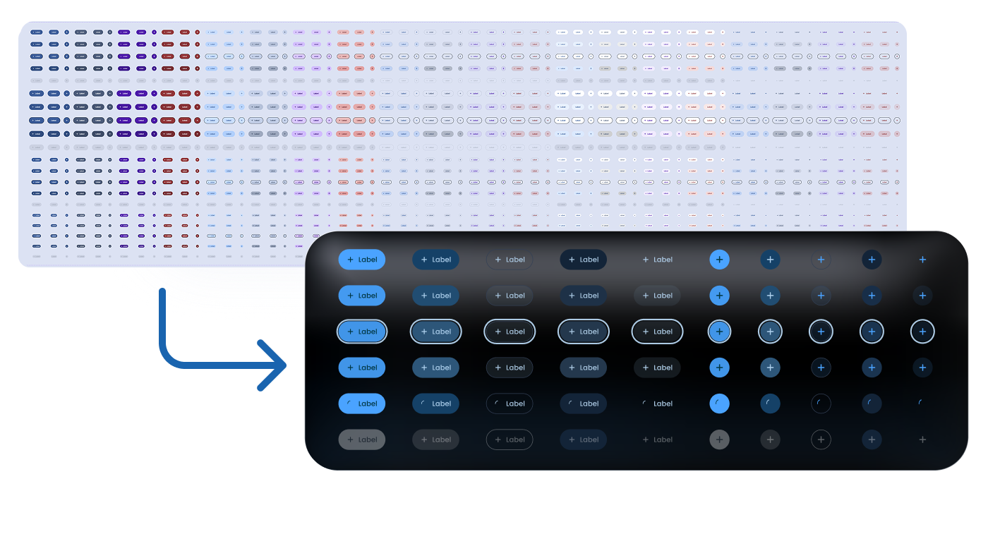
Before tokenizing colors and sizing, our button component had 1,200 variants. This created memory issues in Figma and made it impossible to add buttons for mobile and in-cab contexts.
The first version was a library of components. The rebuild gave it a token architecture underneath.
Token resolution · click to trace
03, Component
Fill Button · Mode: Primary
02, Semantic
Primary · Mode: Dark
01, Primitive
Primary 600
Raw value
#2E8AFF
{{ tTrace }}
The raw values feed the primitives but sit outside the token system itself, so a hex code can change without anything downstream needing to know. Layering this way allows you to change the brand color once at the primitive layer and have it ripple through every component.
This is the part of the kit nobody sees, but everybody benefits from. It's also enabled everything that came next, white-labeling, dark mode, density variants. All of it lives on top of the token layer.
Figma memory dropped from 50% to 8%. Component swaps got instant. The file stopped fighting the designers using it.
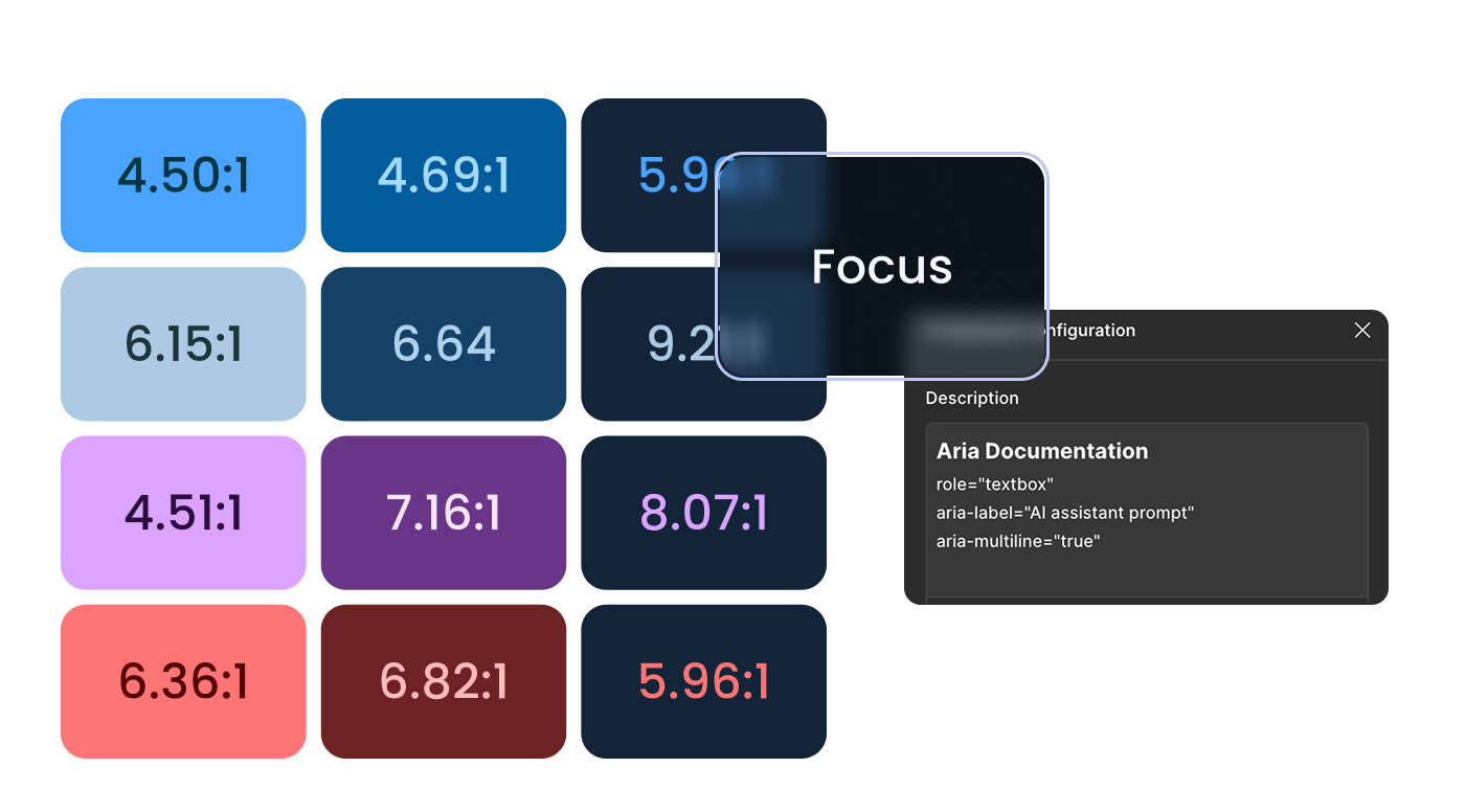
The semantic color naming draws directly from Google Material, leveraged for its documentation, not copied wholesale. The clearest divergence: in my system, the highest surface is always the brightest regardless of mode, because brighter objects read as closer to the viewer. Material's hierarchy flips in light mode and breaks that intuition. Mine doesn't.
Four nested layers, sharing one skeleton across every component.
scroll or click a layer
Four nested layers
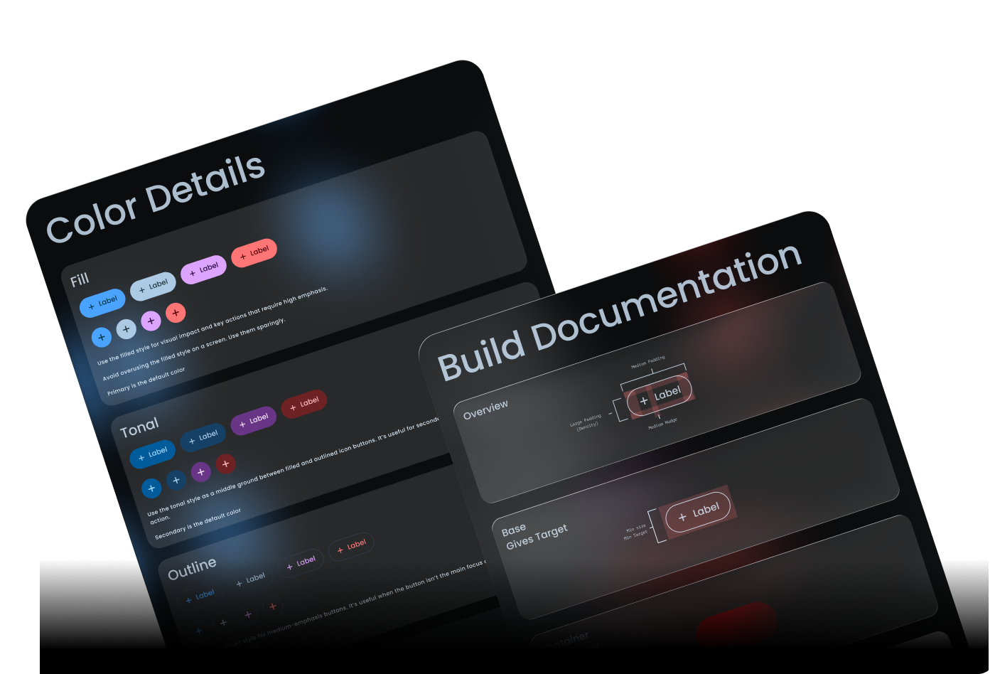
About thirty components.
Inputs, navigation, feedback, data display, structural primitives. Plus some things most kits don't ship: an AI input component, a chat message component, and three navigation variants for different breakpoints.
1,200
→
60
variants, one button component to two components
The 1,200-variant button was creating massive issues with Figma file performance. After the token rebuild: 60 variants cumulatively across two components. Figma memory dropped from 50% to 8%. Component swaps got instant.
One component handles three densities, with no forked work.
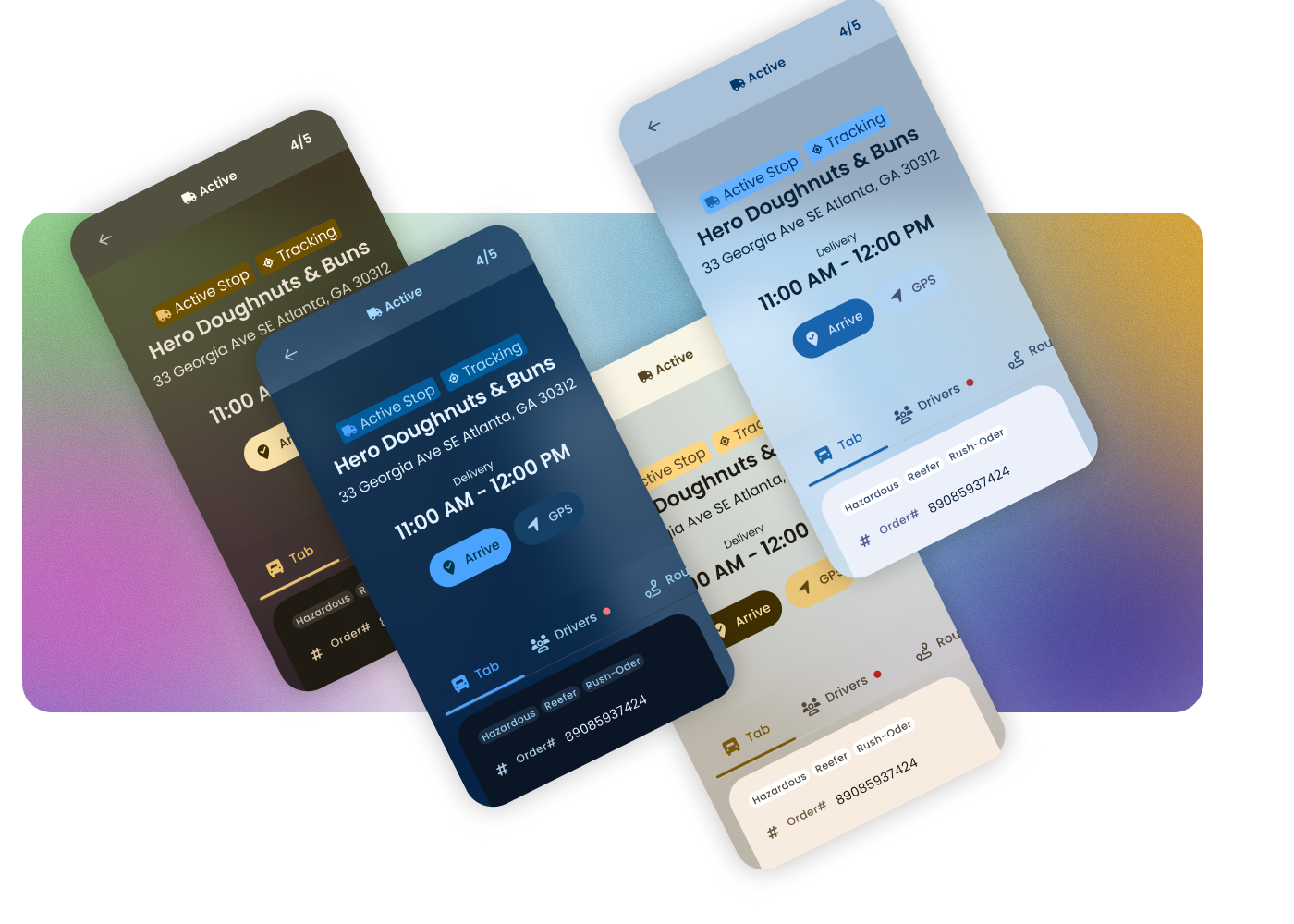
Tranztec ships logistics software, which means some users are truck drivers operating the product from inside a moving vehicle. That's a wildly different interaction context from a dispatcher at a desk.
The numbers below — 24, 48, and 80px — are minimum target sizes: the hittable area, not the visual button. A control can look small and still carry a large, easy-to-hit target. The visual can shrink; the target never drops below the floor.
The in-cab density is the one I haven't seen in other kits. If some of your users are driving while using your product, your minimum target size isn't WCAG's recommendation. It's whatever a person can reliably hit while a truck is moving.
The kit ships with a variety of brand colors for easy white-labeling, with paired light and dark modes per color. Because the semantic layer pulls from Google Material, and Google uses a very similar set of primitives, it was straightforward to leverage Material's theme builder to generate unique palettes.
This isn't a full theming engine. Typography, spacing, and shape are still locked. A real theming engine is on the roadmap. For the color and mode dimension, the kit white-labels cleanly.
A few specifics.
The team had been building React without a system. They didn't have a component library before this kit; everything was bespoke, often built without designs at all. Adoption wasn't a question of migrating off something else, it was about giving them their first foundation.
"Shipping about twice as fast."
— Lance, Senior Dev
He kept telling me, actually. More than once. The first version of the kit handled the "stop building from scratch" problem; the rebuild handled the "make it sustainable" problem. Today, every React component in the product comes from this kit.
If I were building this again, with the time I didn't have the first round, there's a clear next layer.
A real theming engine
Typography, spacing, shape, motion, not just color. Building it well would mean working closely with engineering on how to expose tokens for runtime swapping, how the API should look, and how density and theme should compose.
A contribution model
New components routed through me, which worked at the company's scale with one designer, but it wouldn't have scaled past that. A lightweight intake process and a small governance group are where this kind of system has to go.
Dedicated time, earlier
The whole kit was built in margins. It shipped, it worked, it got adopted, but I'd be lying if I said building a design system in stolen time was the right way to do it. It's just the way it happened.
"Design systems built in stolen time are a different kind of project."
You don't get to do them right the first time. You ship what you can, you watch what breaks, you come back when you can and rebuild the parts that need it. The first version of this kit was good enough to get adopted. The rebuild made it good enough to last. Neither phase had a budget or a team. Both happened anyway, because the alternative was watching the dev team keep building from scratch.
I've since left Tranztec. The kit is still in the product, still the foundation of the React frontend, still doing the work it was built to do. Lance, last I heard, is still shipping twice as fast.
Fuzion
An AI-assisted EDI platform. Describe a data mapping in plain language instead of hand-coding it.
 © 2026 Anthony Carmine Pietramala